cs/25 · client-based work · side project
Glassmorphism
Exploring Figma's glassmorphic design capabilities
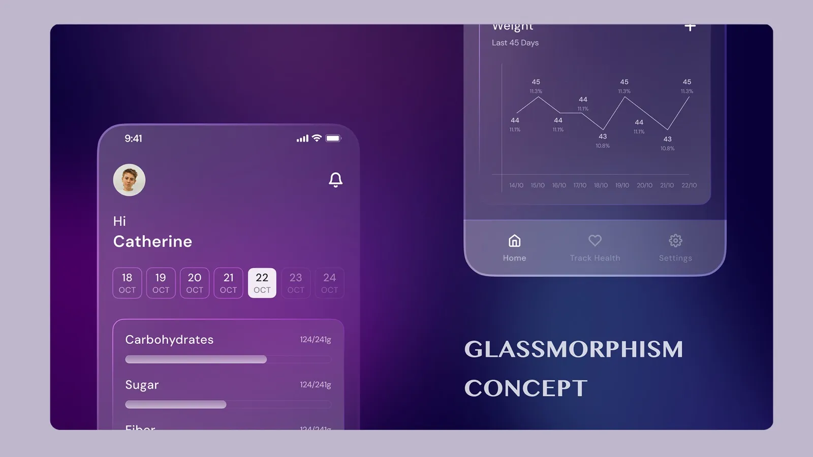
Overview
When Figma introduced new updates supporting glassmorphic design effects, I saw an opportunity to explore this modern visual trend while creating a practical application. I designed a fitness tracker app that leverages glassmorphism - a design aesthetic characterized by semi-transparent elements, subtle blur effects, and layered depth that creates a frosted glass appearance.
Problem
Glassmorphism had become a popular design trend in modern UI, but implementing it effectively required understanding new Figma capabilities for transparency, blur effects, and layered compositions. Many designers struggled to create authentic glassmorphic designs that balanced visual appeal with usability.
For a fitness tracker app specifically, I needed to design an interface that felt modern and visually engaging while maintaining clarity and readability for fitness data. The challenge was creating depth and hierarchy using glassmorphic effects without overwhelming users with visual noise or making content hard to read.
Discovery & Alignment
I explored Figma's new features for glassmorphic design, focusing on:
- Background blur effects and transparency controls
- Layered composition techniques for creating depth
- Color and gradient combinations that work with glass effects
- Typography and contrast considerations for readability over glass elements
- Shadow and border treatments that enhance the glass aesthetic
For the fitness tracker context, I identified key design principles: activity data needed clear visibility, navigation should feel intuitive despite layered elements, and the glass aesthetic should enhance rather than distract from the fitness tracking experience.
Solution Architecture
Glassmorphic Card System: Designed primary information cards with frosted glass effects, using background blur, subtle transparency, and refined borders. Each card contained fitness metrics (steps, calories, workouts) with clear typography that maintained readability over the glass effect.
Layered Depth Hierarchy: Created visual hierarchy through multiple glass layers at different opacities and blur intensities. Important information appeared on more opaque layers, while supporting elements used lighter glass effects to create depth without competing for attention.
Background Integration: Designed dynamic backgrounds with gradients and patterns that work harmoniously with glassmorphic elements. The background provides context while glass layers create separation and focus, maintaining visual interest without overwhelming the interface.
Interactive Elements: Applied glassmorphism to buttons, navigation elements, and interactive components. Hover and active states incorporated subtle animation and opacity changes, maintaining the glass aesthetic while providing clear feedback.
Data Visualization: Integrated fitness charts and progress indicators within glassmorphic containers. Charts remained clear and readable while benefiting from the modern glass aesthetic, creating a cohesive visual language throughout the app.
Figma Feature Mastery: Leveraged Figma's blur effects, opacity controls, gradient overlays, and advanced layer blending modes to achieve authentic glassmorphic effects. Experimented with different blur intensities, border treatments, and shadow combinations to perfect the glass appearance.
Impact
- Demonstrated mastery of Figma's latest glassmorphic design capabilities and visual effects features.
- Created a modern, visually appealing fitness tracker interface that stands out with contemporary design aesthetics.
- Established best practices for implementing glassmorphism in practical applications while maintaining usability.
- Showcased ability to explore and adopt new design trends and Figma features quickly.
- Proved that glassmorphic design can be applied effectively to data-heavy interfaces like fitness tracking.
- Created a portfolio piece that demonstrates both technical proficiency and modern design sensibility.
Learnings
Glassmorphism works best when it enhances rather than dominates the design. The key is balance - enough transparency and blur to create the glass effect, but sufficient opacity and contrast to maintain readability. Background selection is crucial; complex backgrounds can make glass elements hard to read, while simple gradients provide ideal contrast.
Layering glass elements requires careful consideration of opacity and blur intensity. Too much blur can make text illegible, while too little transparency loses the glass aesthetic. Each layer needs intentional placement in the visual hierarchy to guide user attention effectively.
Figma's new glassmorphic capabilities opened creative possibilities, but successful implementation requires understanding the technical aspects (blur radius, opacity values, border treatments) and the design principles (depth, hierarchy, readability). This project reinforced that staying current with design tool updates enables creating more sophisticated and contemporary interfaces.
For fitness apps specifically, glassmorphism can create a premium, modern feel while still allowing clear data presentation. The key is using glass effects strategically - for containers, navigation, and decorative elements - while keeping core data displays clear and readable.
Link to Design File